Altitude 720 Cafe & Bar
Services: Logo Design, Branding and Identity Design
Web address: tekaposprings.co.nz/bar-cafe
Project info
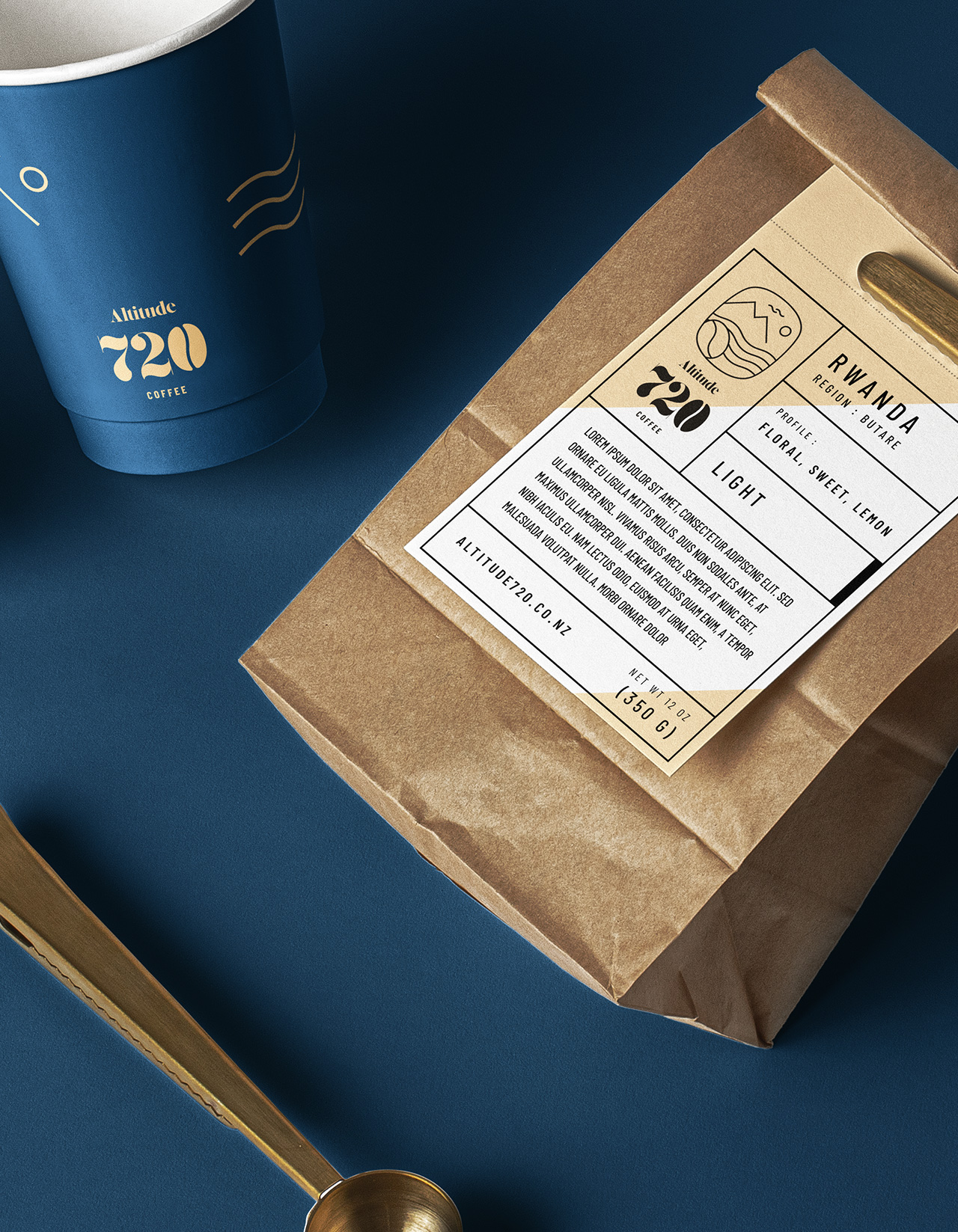
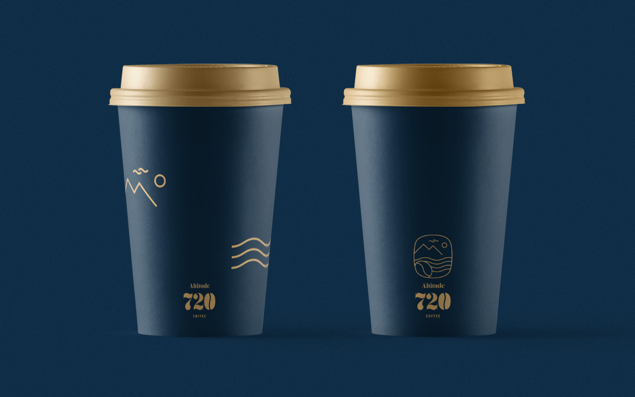
We were excited to continue our relationship with Tekapo Springs, this time we worked on the brand design, logo and packaging for their onsite cafe & Bar, Altitude 720. We took the blue and yellow colours used throughout the Tekapo Springs branding and made them richer, darker and bolder to reflect the nature of their coffee as well as portray the premium quality of the product and service.
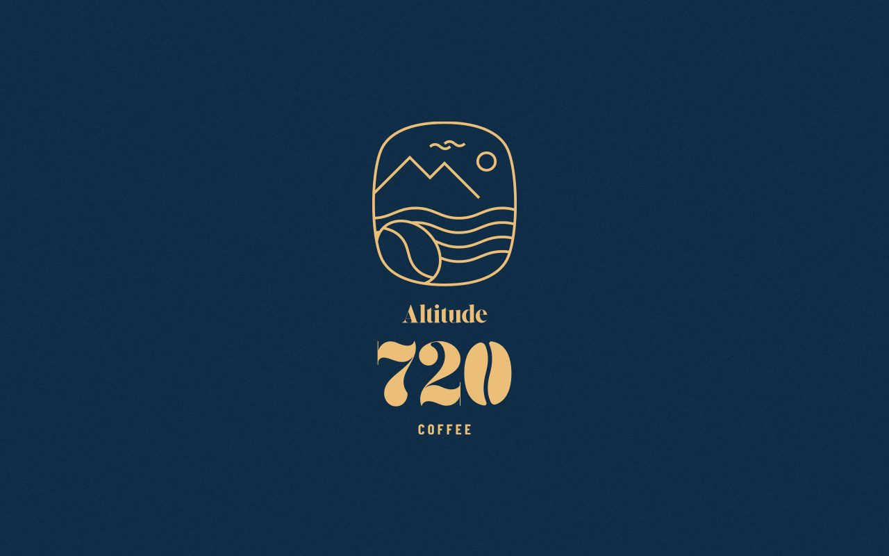
The logo is a refined hand drawing of the lake, hills and trees that surround the local area, reflecting the views that customers would experience in the cafe. This imagery was also used as subliminal advertising, the natural elements in the logo suggest purity, cleanliness, freshness and premium quality. With little effort we have created a brand, logo and packaging that customers will see and within seconds they will know that this is a premium, healthy product that they want to purchase.
