Florencias Health & Beauty
Services: Logo Design, Branding and Identity Design
Project info
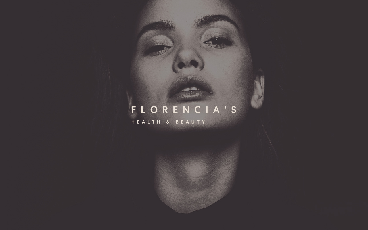
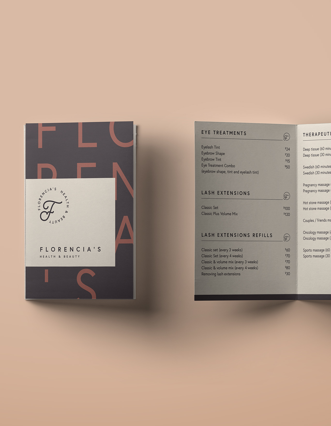
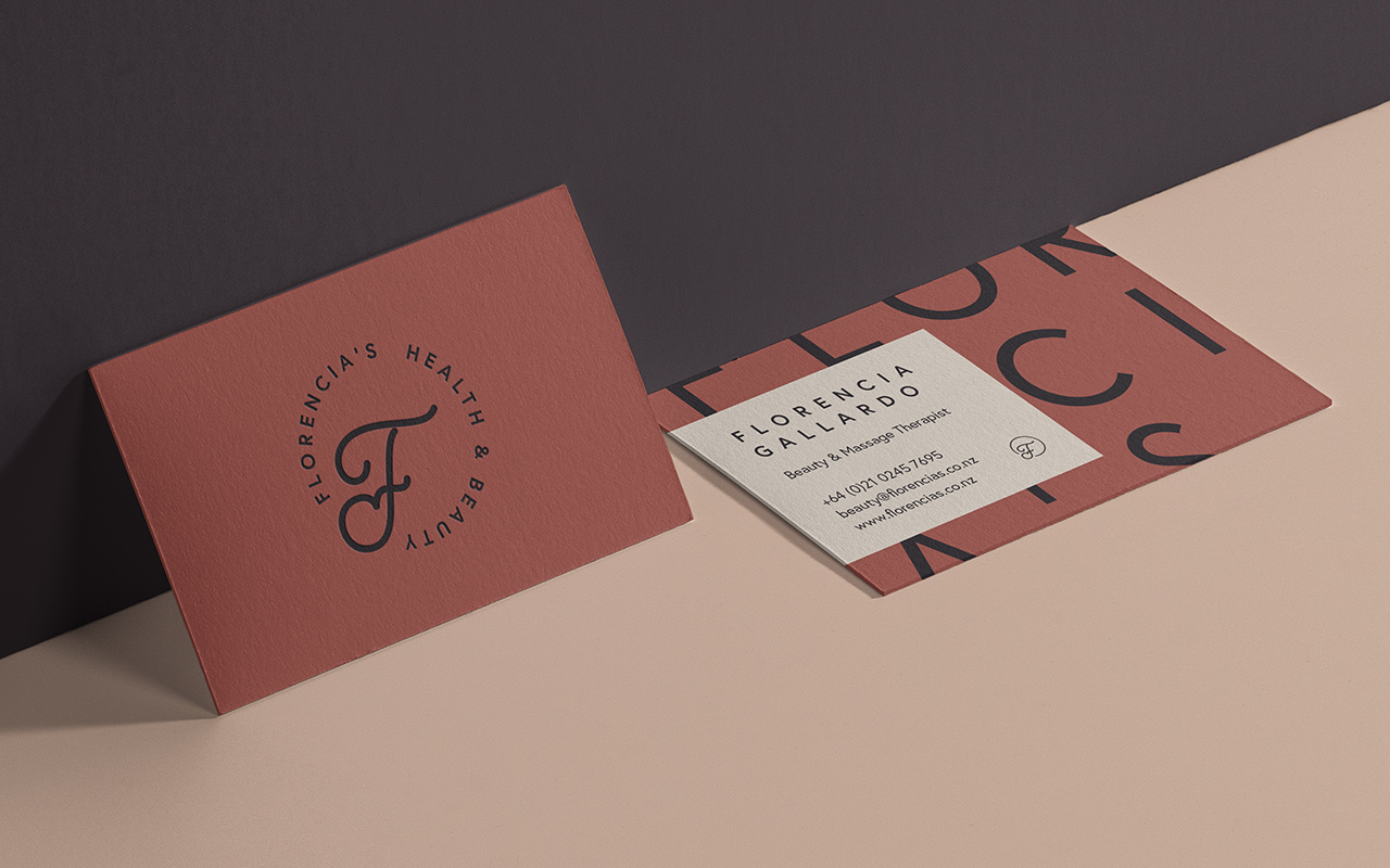
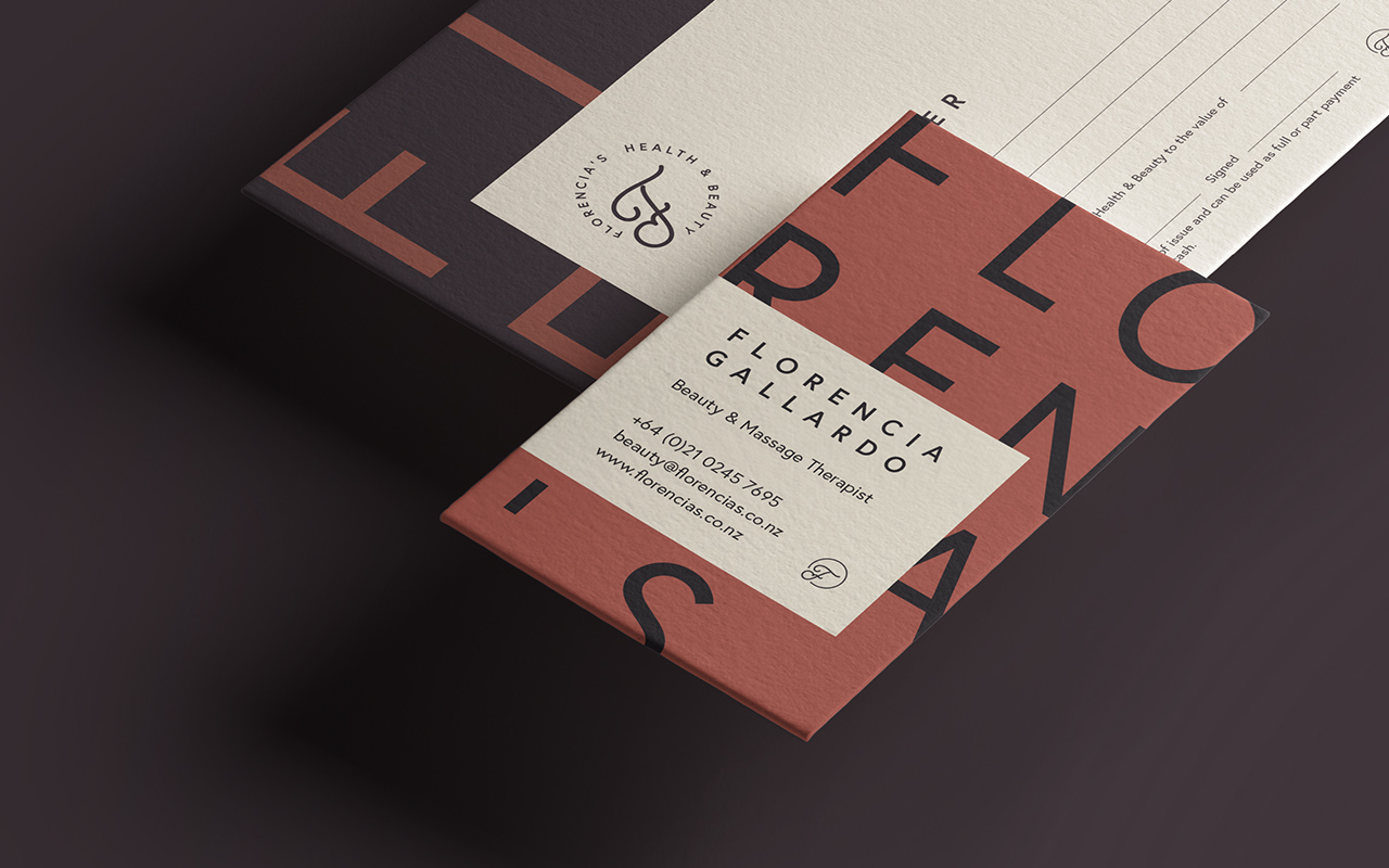
SPF were briefed to create a logo and brand identity for Florencias Health and Beauty Salon. We started with the logo, creating a unique hand drawn, elegant ‘F’ to be the focal point. We took inspiration from high end European salons for this lettering. The cursive font style is elegant and formal but we have rounded it off to make it feel more approachable this is to give the impression that the service is high end but it will be a welcome and comfortable experience. We juxtaposed this soft, elegant cursive F with a strong, ultramodern uppercase body font. This style font is very on trend in the fashion and beauty industries and will appeal to a young audience, Florencias primary demographic.
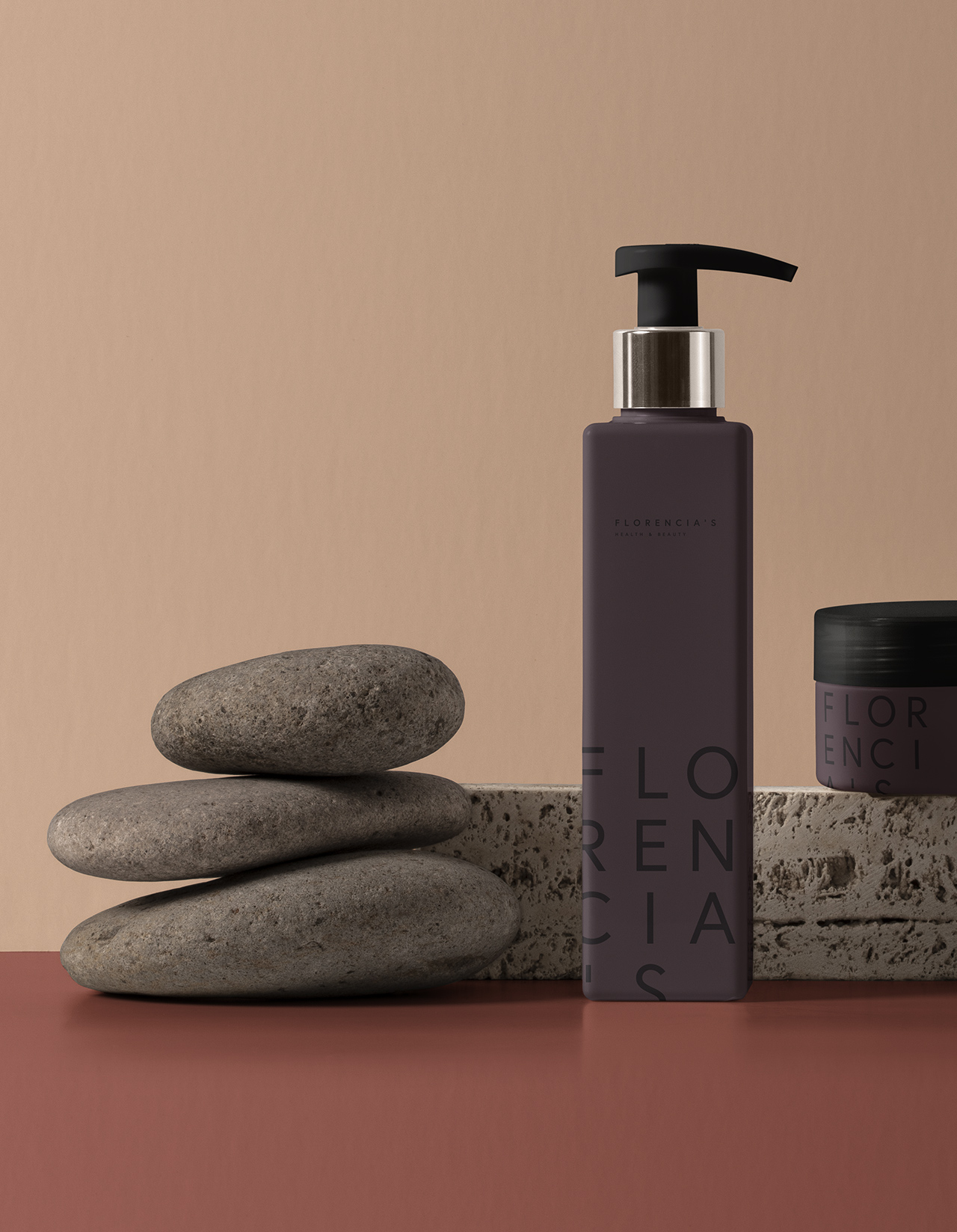
The soft, earthy colour palette is warm and calming, this is to create an inviting atmosphere, to get customers to think “this looks like a great place to relax and take care of my body”. The other reason we use an earthy colour palette was to draw a parallel to the clay based skin care products that Florencia uses. This clay red colour gives the impression that everything is natural and that there are no harsh chemicals used in any of the salon products.