Solve Physio
Services: Website Design, Logo Design, Branding and Identity Design Web address: solvephysio.co.nz
Project info
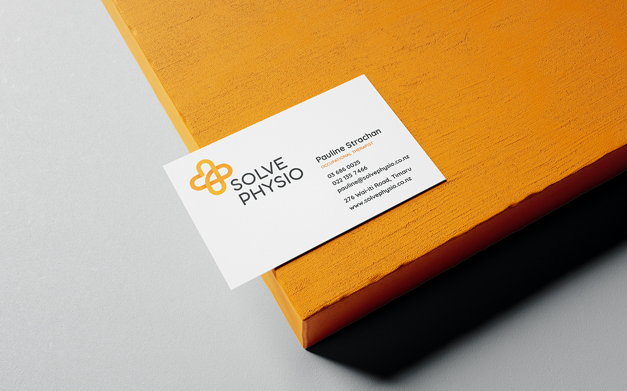
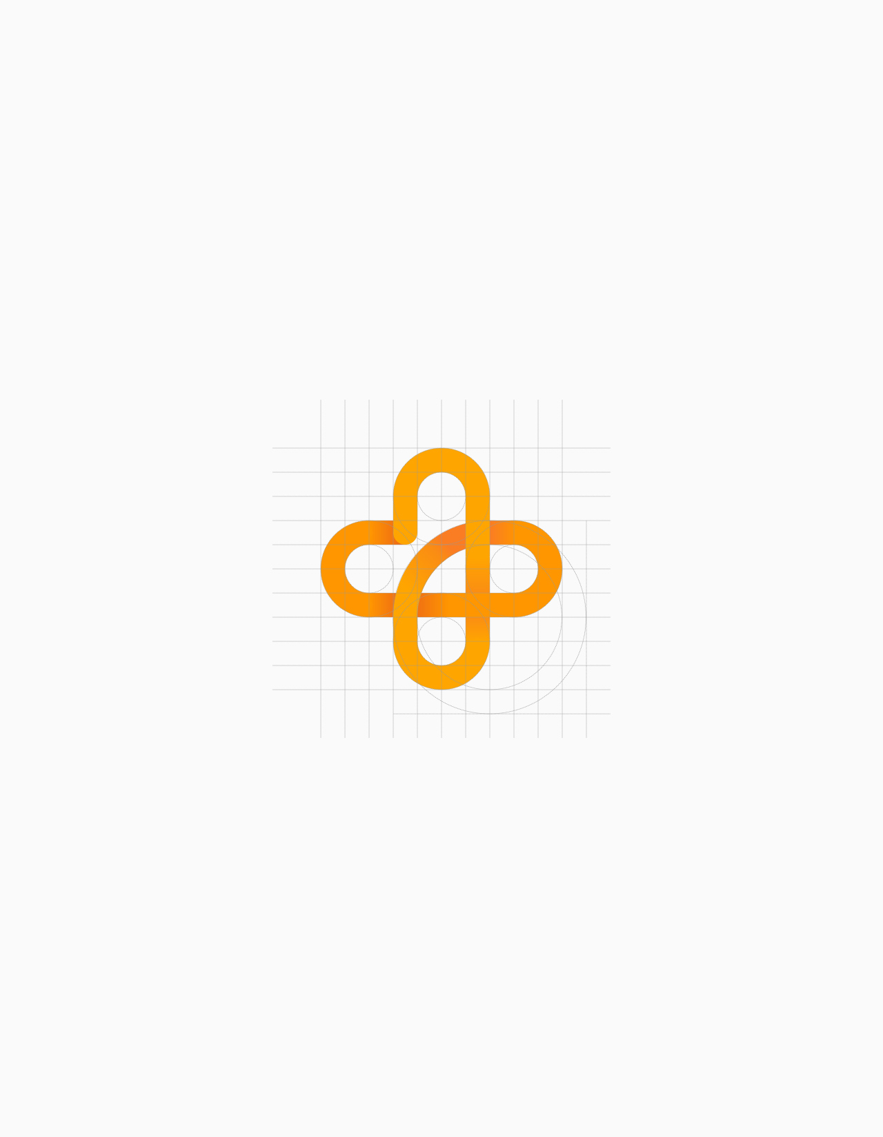
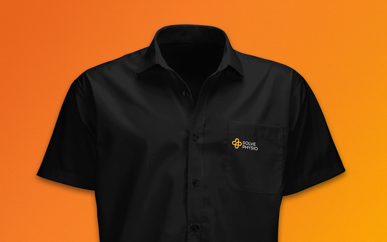
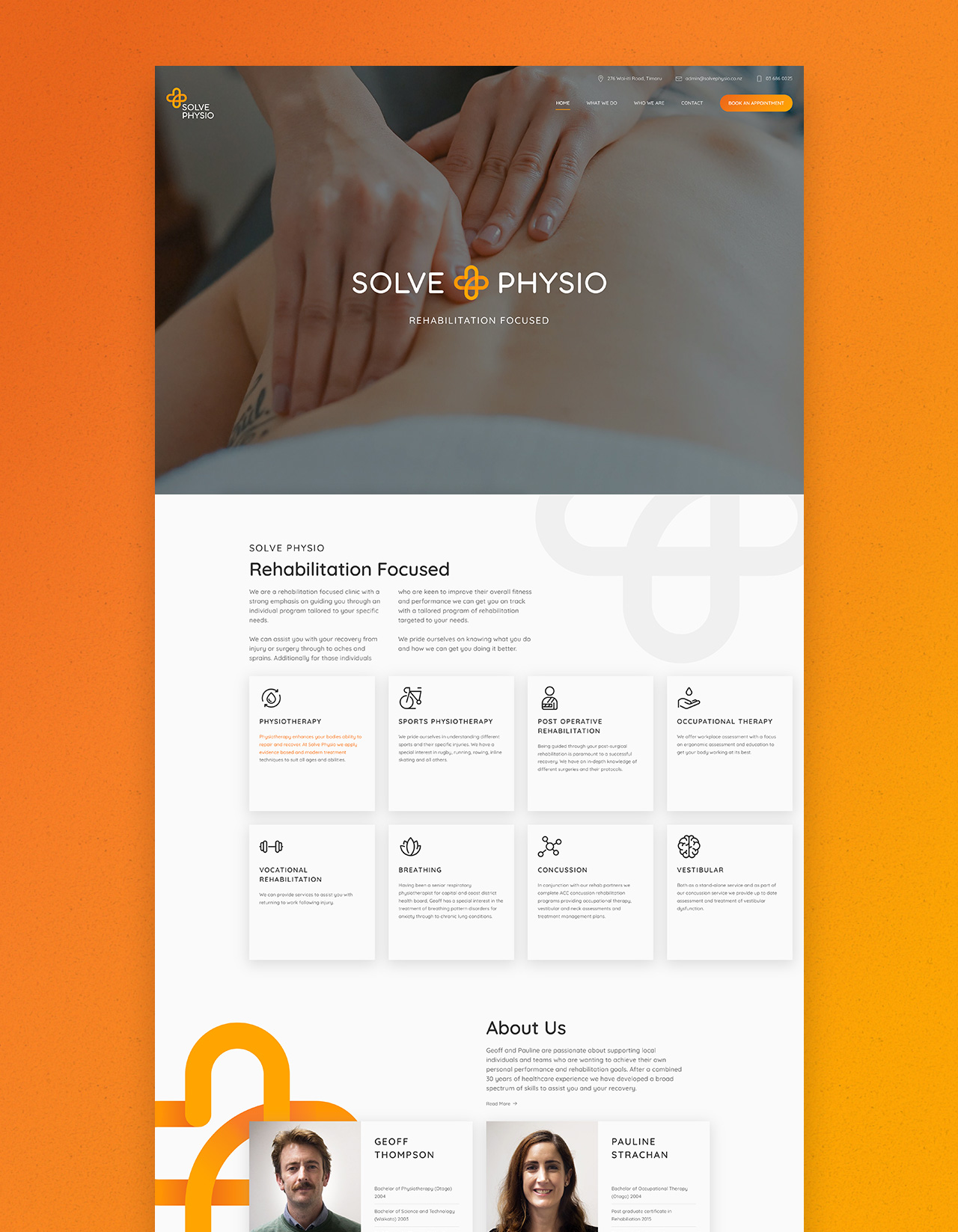
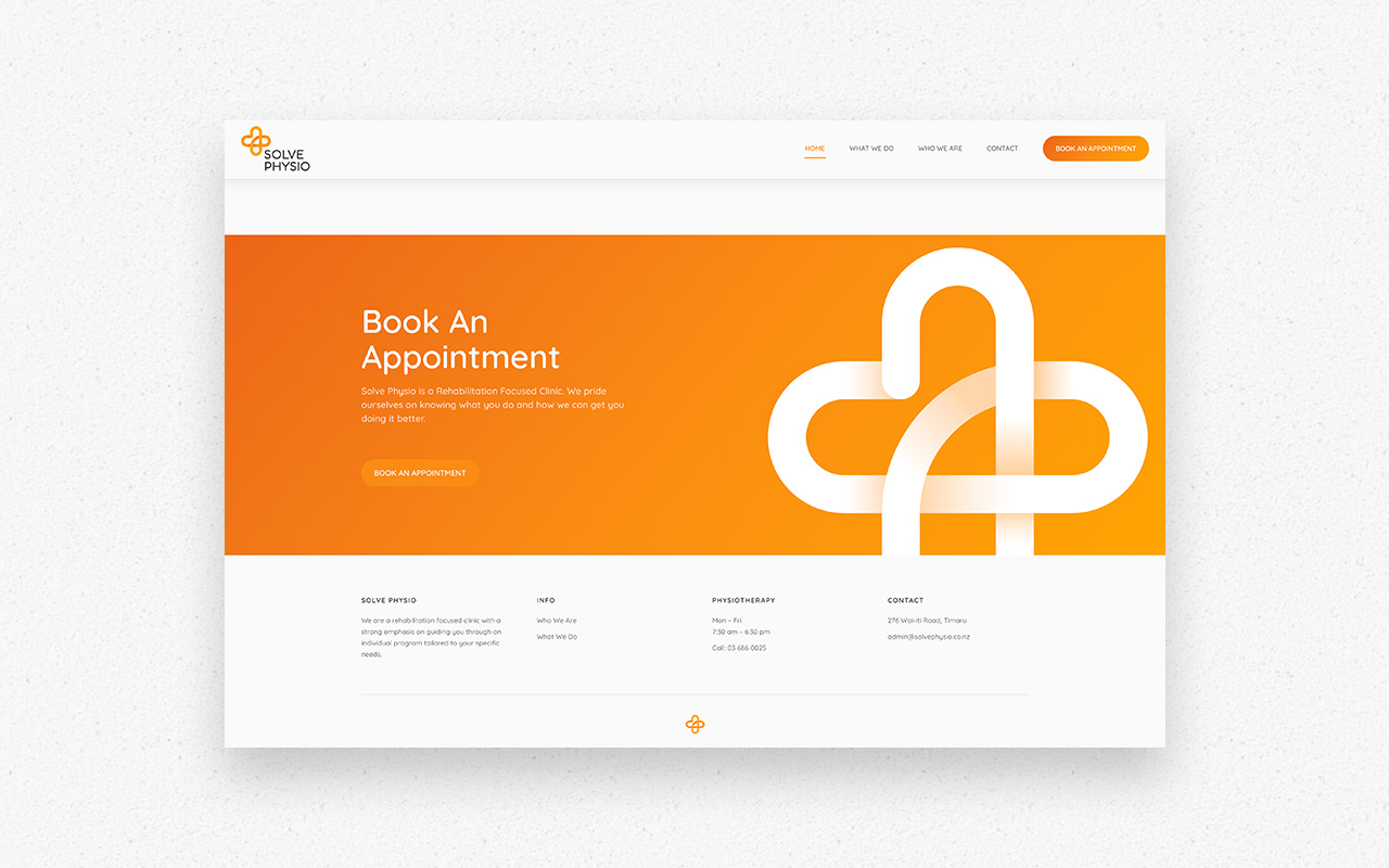
We created a Logo that was synonymous with health and wellbeing, taking well know icons such as the cross and heart and fusing them into one Logo. Using soft rounded elements helped emphasize the theme of caregiving we were trying to achieve. The bold colour choice was used in conjunction with the soft, gentle icon to convey that this was a caregiving service that focused on sports rehabilitation. The branding revolved around this logo using elements of the logo as overlays. The smooth curvature creating points of interest yet not taking away the focus from the information being presented.
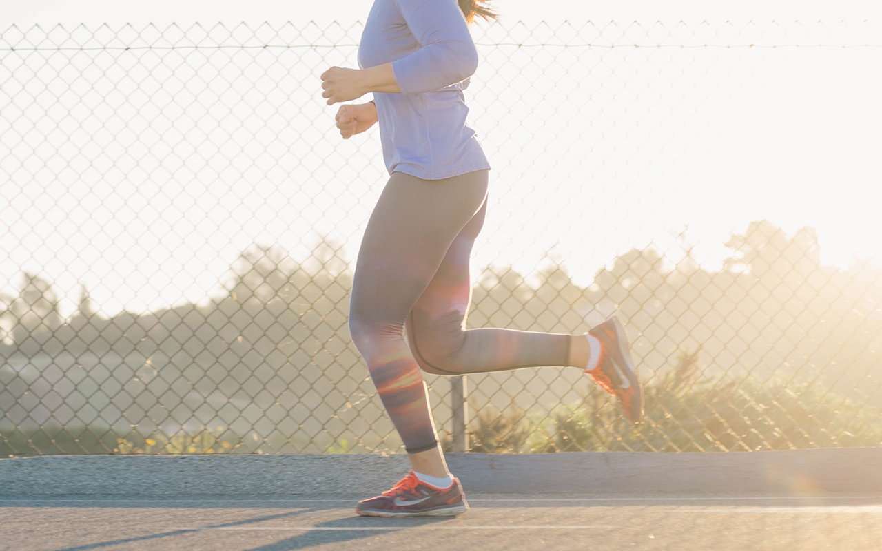
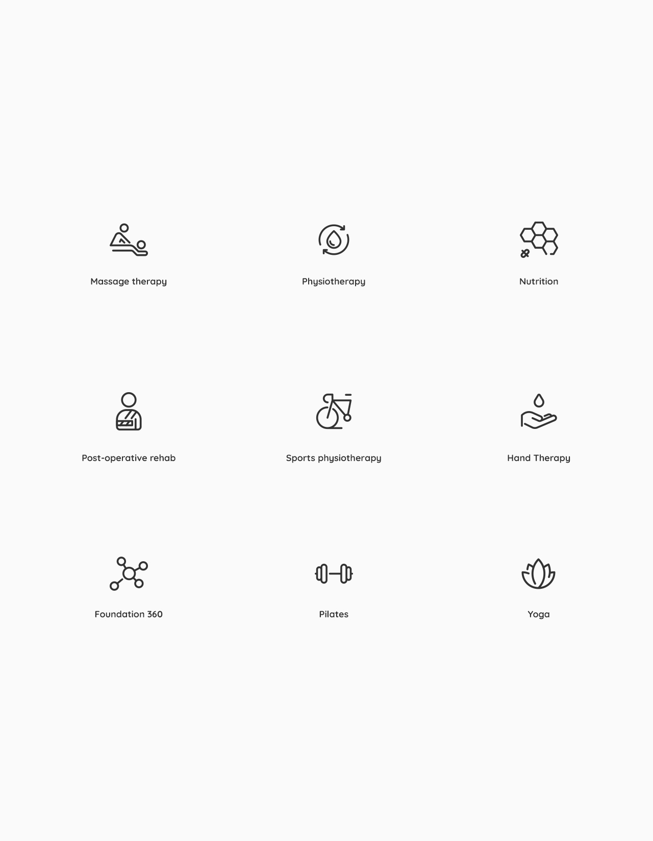
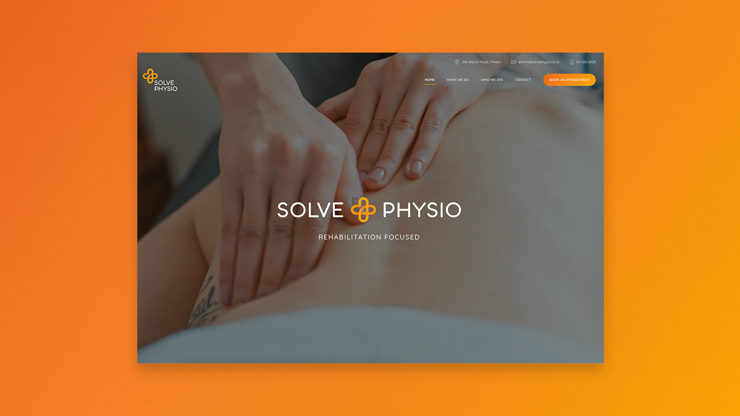
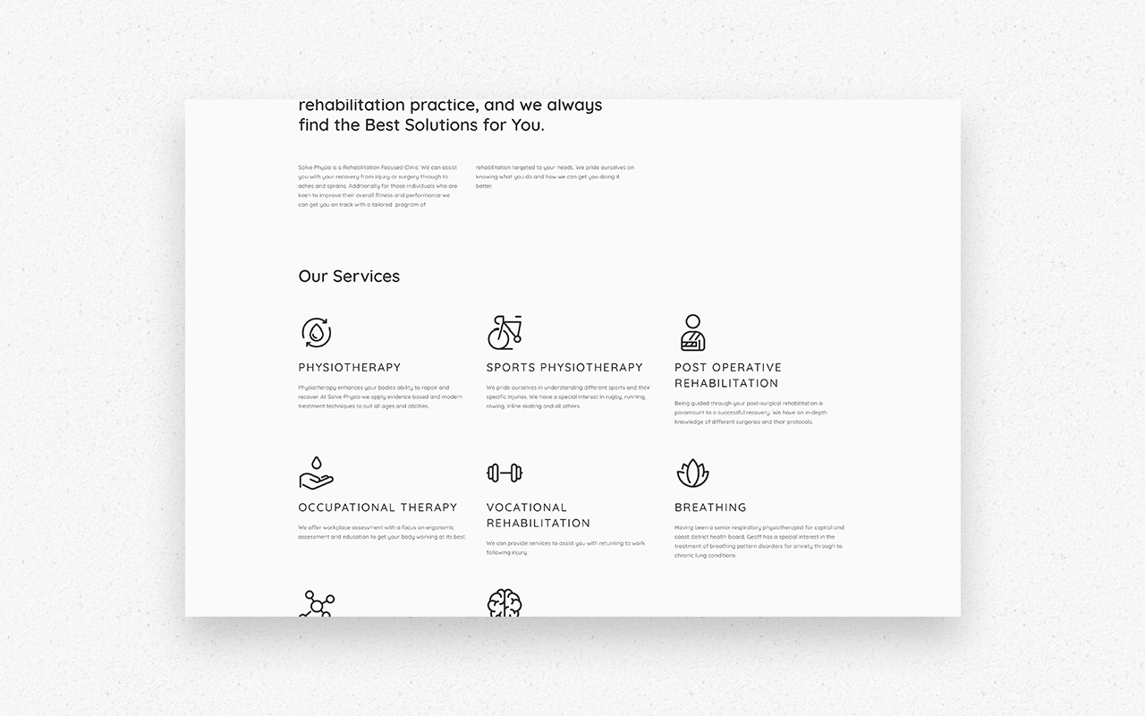
The website brief was to create a practical interface that made it easy to navigate and book appointments. Using colour graded imagery and a soft font we were able to create a website that was not only cohesive with the branding but enjoyable to use.


Solve Physio
Services: Website Design, Logo Design, Branding and Identity Design Web address: solvephysio.co.nz
Project info
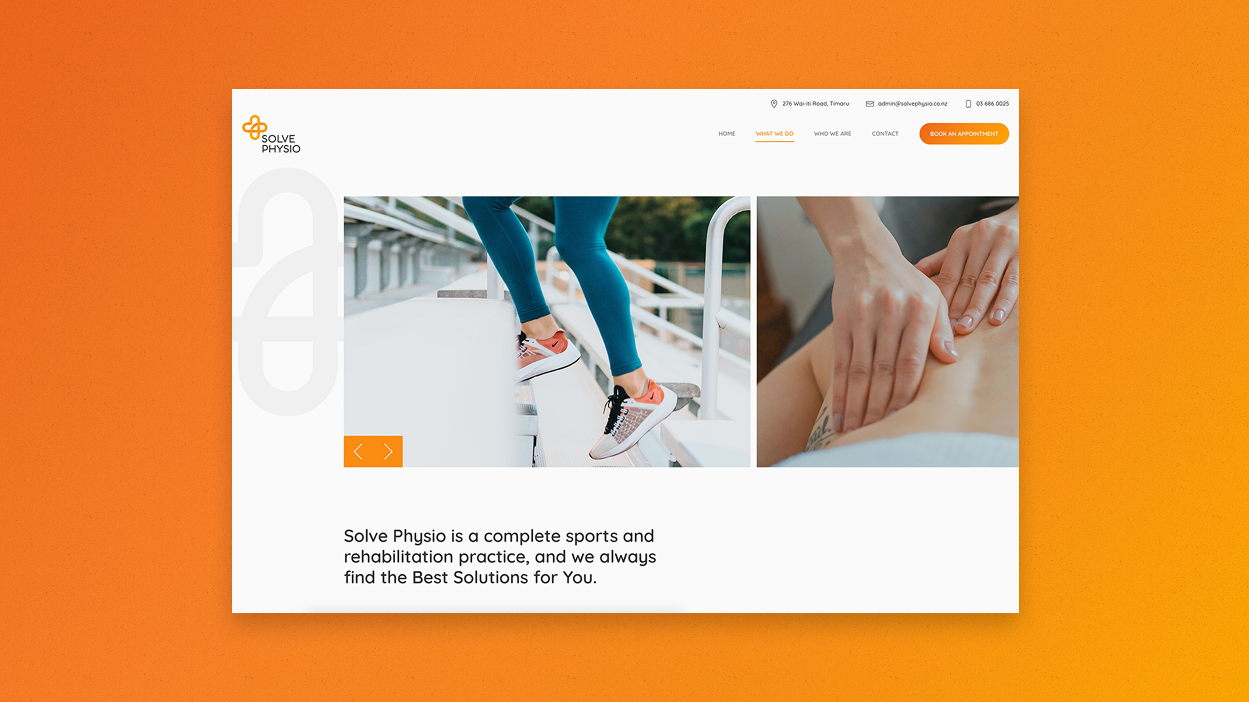
We created a Logo that was synonymous with health and wellbeing, taking well know icons such as the cross and heart and fusing them into one Logo. Using soft rounded elements helped emphasize the theme of caregiving we were trying to achieve. The bold colour choice was used in conjunction with the soft, gentle icon to convey that this was a caregiving service that focused on sports rehabilitation. The branding revolved around this logo using elements of the logo as overlays. The smooth curvature creating points of interest yet not taking away the focus from the information being presented.
The website brief was to create a practical interface that made it easy to navigate and book appointments. Using colour graded imagery and a soft font we were able to create a website that was not only cohesive with the branding but enjoyable to use.
Solve Physio
Services: Website Design, Logo Design, Branding and Identity Design Web address: solvephysio.co.nz
Project info
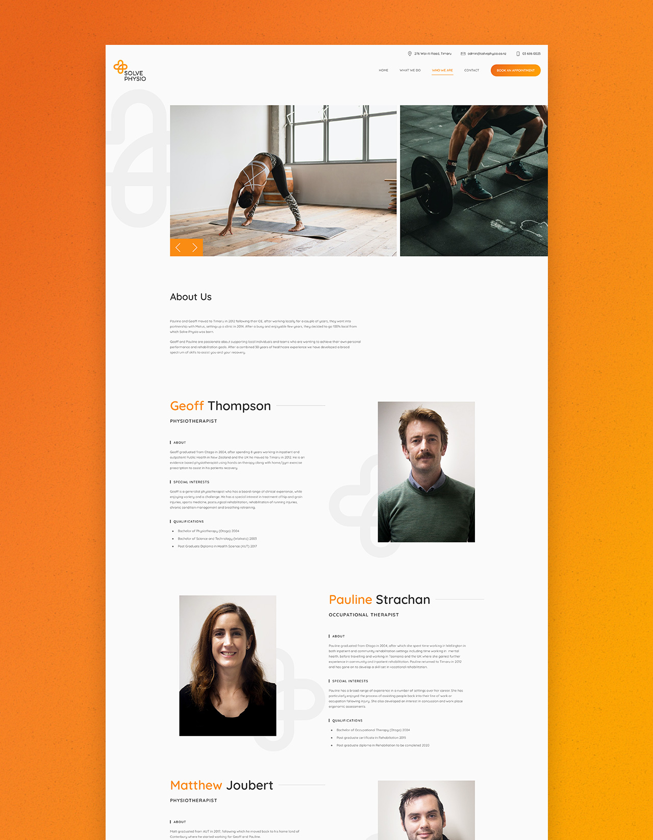
We created a Logo that was synonymous with health and wellbeing, taking well know icons such as the cross and heart and fusing them into one Logo. Using soft rounded elements helped emphasize the theme of caregiving we were trying to achieve. The bold colour choice was used in conjunction with the soft, gentle icon to convey that this was a caregiving service that focused on sports rehabilitation. The branding revolved around this logo using elements of the logo as overlays. The smooth curvature creating points of interest yet not taking away the focus from the information being presented.
The website brief was to create a practical interface that made it easy to navigate and book appointments. Using colour graded imagery and a soft font we were able to create a website that was not only cohesive with the branding but enjoyable to use.